As a scientific illustrator and exhibit designer, your role isn’t just about creating beautiful and accurate visuals. It’s about conveying complex information in a way that engages and educates a specific audience. Understanding who that audience is – and what they need from your work – is arguably the most crucial step in the entire creative process.
From deciding on the level of detail to choosing an appropriate illustrative style, audience determination influences almost every decision you make. Let’s dive into why this initial step is so important, and how it shapes the outcome of your work.
Audience Determines the Style
The illustrative style you choose will largely depend on who you’re trying to reach. Are you creating an exhibit for children? A poster for fellow researchers? An infographic for the general public?
For children, the style needs to be more approachable and engaging. Bright colors, playful shapes, and simplified forms might work better to capture their attention and facilitate understanding. More abstract representations can help visualize concepts without overwhelming young minds with too much complexity.
On the other hand, if your audience is research scientists, your illustrations might lean toward more technical accuracy and detail. A highly detailed, realistic depiction might be necessary to highlight specific structures or biological processes that require careful scrutiny. A polished, scientific style, with precision in scale and proportions, would communicate the intricate nuances that professionals in the field would expect.
Even for the general public, the style has to be more accessible. Simplified graphics with clear lines, bold text, and easy-to-understand color coding can make complex scientific data digestible. Here, visual appeal becomes just as important as the factual accuracy – ensuring the artwork doesn’t overwhelm the viewer while still educating.
Understanding the preferences and needs of your target audience allows you to select a style that resonates with them and maximizes the impact of your visuals.
Language and Terminology Matter
The language you use in your designs also varies significantly based on who’s viewing them. If you’re designing an exhibit for high school students, you’ll need to adapt your language to be informative yet simple, avoiding jargon or overly technical terms. Clear, concise explanations accompanied by relatable examples or metaphors help break down concepts and ensure that the audience can engage with the material.
For a more scientific audience, however, precision in language becomes paramount. Using specific terms and explanations grounded in research is not just expected, but required. Here, the illustrative content will often be accompanied by complex, field-specific terminology to ensure the work’s integrity and relevance.
Knowing your audience helps you balance the complexity of the language used with their understanding. When you miss this mark, you risk losing your audience’s attention – either by making things too simple, leaving out important information, or by making things too complicated, causing confusion and disengagement.
Content is Tailored to Audience Needs
When you understand your audience, the content you include in your piece becomes far more targeted and relevant. An illustration that’s too general won’t be as impactful as one that’s tailored to the specific needs and interests of the viewer.
For example, if your exhibit is aimed at tourists in a natural history museum, they may be more interested in visualizing the habitats and behaviors of animals, rather than the minute details of their anatomy. An animal’s skeleton or internal organs might be unnecessary here; instead, an engaging narrative of the species’ place in the ecosystem could be more appropriate.
For a research-oriented exhibit or publication, however, showcasing the internal structures, genetic information, or cellular processes of an organism could be essential. In this case, illustrations become tools for deeper learning, providing insight into complex scientific phenomena that a layperson might not appreciate.
By analyzing your audience’s interests and educational level, you ensure that the content you include is both engaging and informative, meeting their expectations without overloading them with irrelevant information.
How the Audience Shapes the Narrative
Audience consideration also extends beyond just visuals and terminology. It shapes the narrative of the entire project. What story do you want to tell with your exhibit or illustration? What message should be conveyed?
If you’re presenting climate change data to a general audience, your narrative might focus on compelling visuals that highlight urgent issues and possible solutions. It might emphasize storytelling techniques – showing how climate change impacts everyday life, or featuring success stories of restoration.
For a scientific community audience, the narrative might delve into more specific mechanisms of climate change, focusing on research findings, data accuracy, and detailed models. The tone shifts from evocative and motivational to factual and critical.
A well-defined understanding of your audience allows you to craft the most effective narrative, which aligns with their needs, challenges, and interests.
Empathy Drives Effective Design
Ultimately, the process of determining your audience is all about empathy. By understanding the demographics, interests, educational level, and expectations of the people who will interact with your work, you can create illustrations and exhibits that speak directly to them. This foundational step not only informs your decisions about style, language, and content, but it helps ensure that your work achieves its ultimate goal – to inform, educate, and inspire.
Whether you’re illustrating a complex scientific concept or designing an exhibit to showcase the wonders of nature, always remember that your audience is at the heart of every choice you make. When you get this right, the rest of the design process will follow smoothly, and your work will resonate in ways that purely technical considerations could never achieve.

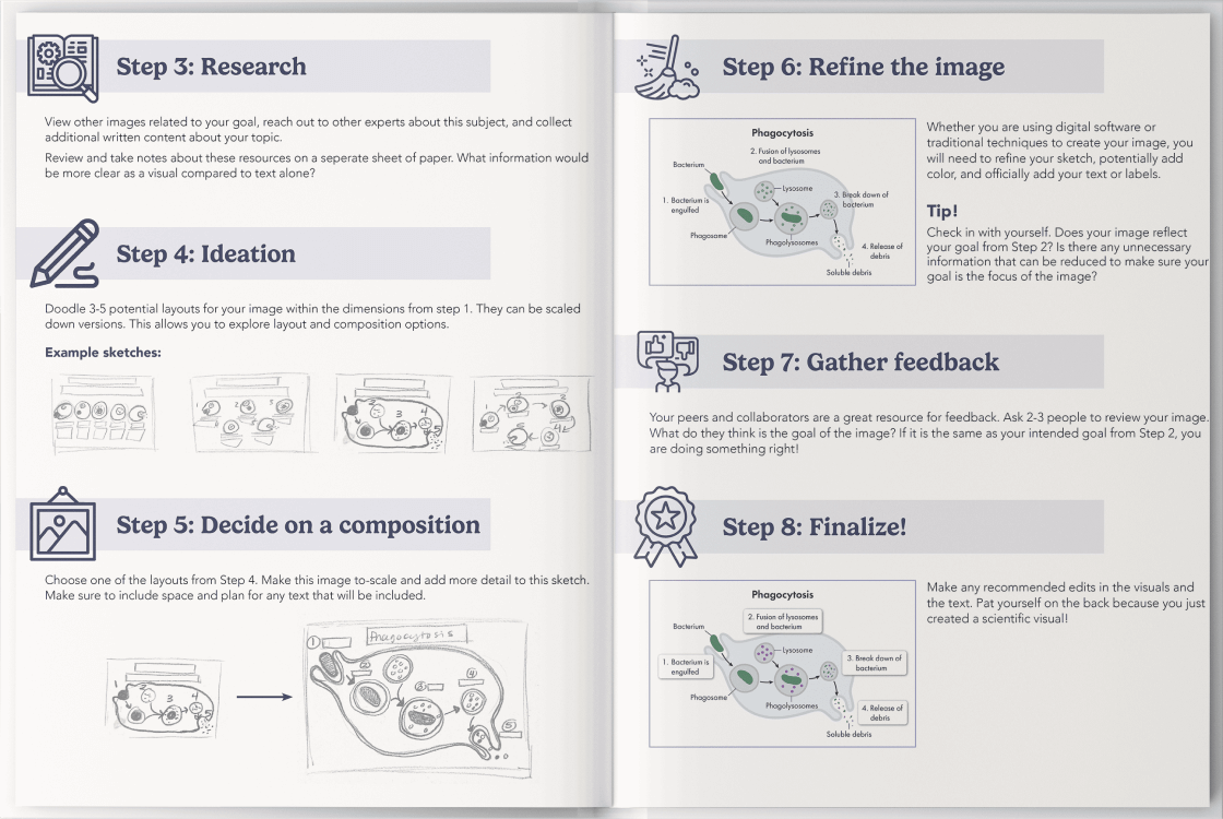
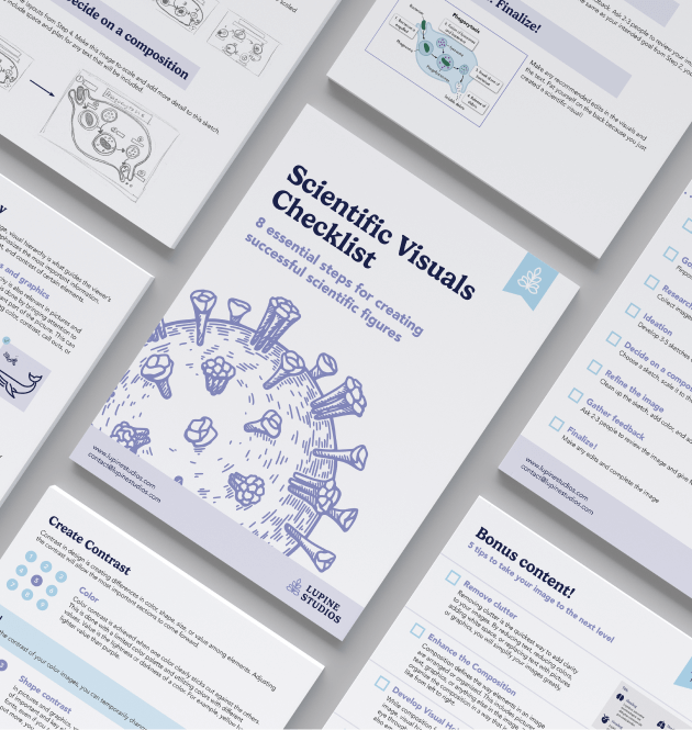
Level up your visuals with this easy-to-follow guide
Learn More about the Checklist