When we think of science exhibits, we often imagine stunning visuals, hands-on experiences, and curious visitors of all ages. But how often do we consider who those exhibits are really built for?
Too often, design decisions, however unintentional, exclude visitors with disabilities or neurodivergence, or those who process information differently. As exhibit designers and science communicators, it’s our responsibility to create experiences that welcome everyone, not just those who fit a narrow standard of ability.
At Lupine Studios, we believe that the heart of inclusive design isn’t just about meeting regulations, it’s about fostering understanding and sparking curiosity in all bodies and minds. Let’s explore how text, color, and interactivity can work harder to include more people in the scientific conversation.
Clear, Accessible Text
Text is one of the most overlooked areas of accessibility in exhibit design. It’s easy to assume that if someone is standing in front of your exhibit, they can read just fine. But vision impairments, learning disabilities, and cognitive processing differences can make that assumption fall apart.
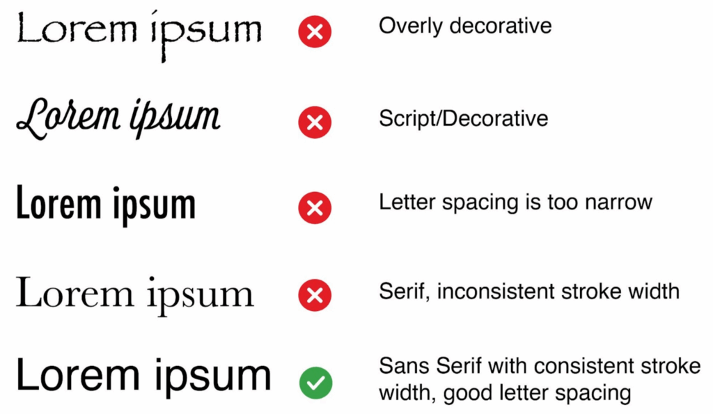
The Americans with Disabilities Act (ADA) offers baseline requirements for text size, spacing, and contrast. For most exhibit environments, body text should be at least 18pt, with 24pt+ used for headers or titles. But even beyond size, font choice can significantly impact legibility.
Avoid decorative or overly stylized fonts for anything more than an accent. Stick with clean sans-serif fonts (like Helvetica, Lato, or Open Sans) that are easier to scan. High letter spacing and consistent stroke width improve readability for visitors with dyslexia or low vision and make it easier for everyone to absorb content quickly in a bustling exhibit space.
Even if you’re a strong reader, poorly chosen fonts can slow comprehension, especially when combined with low lighting or glare. Clear text supports better learning across the board.
The average reading level in the U.S. is around an 8th-grade level, and even lower for many adults. To ensure your exhibit is understandable to a wide audience, aim for plain, straightforward language. Avoid technical jargon unless it’s explained, and don’t rely on slang, idioms, or cultural shorthand.
This is especially important for visitors who don’t speak English as their first language. Clear, literal phrasing helps make your content more universally accessible and ensures your science story isn’t lost in translation.
Color Matters
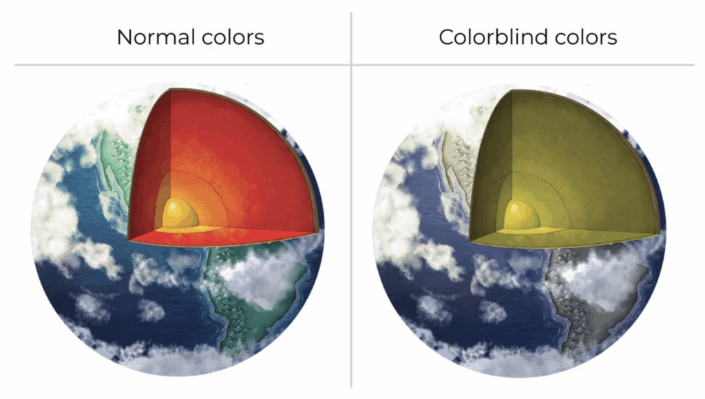
Color is a powerful storytelling tool, especially in science communication where we rely heavily on graphs, heat maps, and coded diagrams. But it’s also a major accessibility challenge.
Approximately 1 in 12 men and 1 in 200 women have some form of color vision deficiency. Red-green colorblindness is the most common, which poses obvious problems in data visualizations that use red for “hot” and green for “cool,” for example.
Use colorblind-friendly palettes and never rely on color alone to convey information. Incorporate patterns, labels, and icons to support meaning. Tools like Color Oracle can help simulate what your design will look like to users with various types of color blindness.
When using colored text on a colored background, the ADA recommends a contrast ratio of at least 4.5:1 for normal text and 3:1 for large text. This ensures that content is visible in low-light spaces and to users with low vision. Resources like WebAIM offer free tools to test color contrast.
Interactive Spaces
Interactive elements like touchscreens, buttons, levers, and sound domes, are often the most memorable parts of an exhibit. But without thoughtful design, they can also be the most exclusionary.
Interactive elements must be reachable and usable by people using wheelchairs, walkers, or with limited reach and dexterity. Consider height ranges, space for turning radius, and alternate input methods.
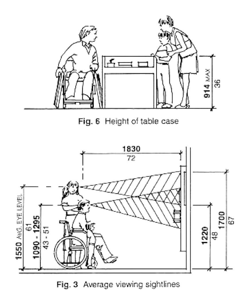
Not everyone interacts the same way. A tactile model or audio-based experience can be transformative for blind or low-vision visitors and engaging for all users. Offer captions, audio descriptions, or vibrational feedback where possible.
Interactive science experiences foster deeper understanding. When they’re accessible, they don’t just inform, they empower. Thoughtful interactivity says: “You belong here. Science is for you, too.”
Beyond Compliance
Accessibility isn’t just a checklist, it’s a mindset. The most impactful exhibits are made with empathy, not just standards.
Involve people with disabilities in your design process. Conduct usability testing with diverse audiences. Consider neurodiverse experiences, like offering quiet zones, simplifying instructions, or avoiding overwhelming animations.
Universal Design is the idea that spaces should be usable by everyone to the greatest extent possible to benefit all visitors. A ramp helps wheelchair users and parents with strollers. A high-contrast label helps someone with low vision and someone reading in a dim room. When we design for the margins, we improve the experience for everyone.
Science is for Everyone, Let’s Design Like It
Inclusion isn’t an add-on, it’s the foundation of good science communication. When we design exhibits that everyone can read, see, and interact with, we break down barriers to discovery.
At Lupine Studios, we’re passionate about creating visual stories and exhibit experiences that make science more accessible, more beautiful, and more meaningful for everyone who walks through the door.
Let’s build spaces where all minds can engage, wonder, and explore. That’s when real learning begins.
Sources consulted
Eltorai, A. E. M., Ghanian, S., Adams, C. A., Born, C. T., & Daniels, A. H. (2014, April 30). Readability of patient education materials on the American Association for Surgery of Trauma Website. Archives of trauma research. https://pmc.ncbi.nlm.nih.gov/articles/PMC4139691/
About colour blindness – colour blind awareness. Colour Blind Awareness. (n.d.). https://www.colourblindawareness.org/colour-blindness/
For more information, check out these resources!
- Web Accessibility Initiative (view ADA guidelines)
- Smithsonian Guide for Accessible Exhibit Design (read more about making exhibits more accessible)
- Colourblind Awareness (learn about colorblindness)
- National Eye Institute (learn about colorblindness)
- WCAG Contrast Checker – WebAIM (color contrast checker)
- Color Oracle (computer app for viewing in colorblind mode)

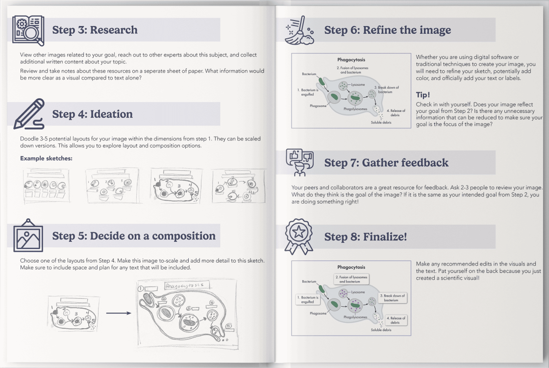
Level up your visuals with this easy-to-follow guide
Learn More about the Checklist